By NFC Business Cards Editorial Team | Published | Updated | Materials & design
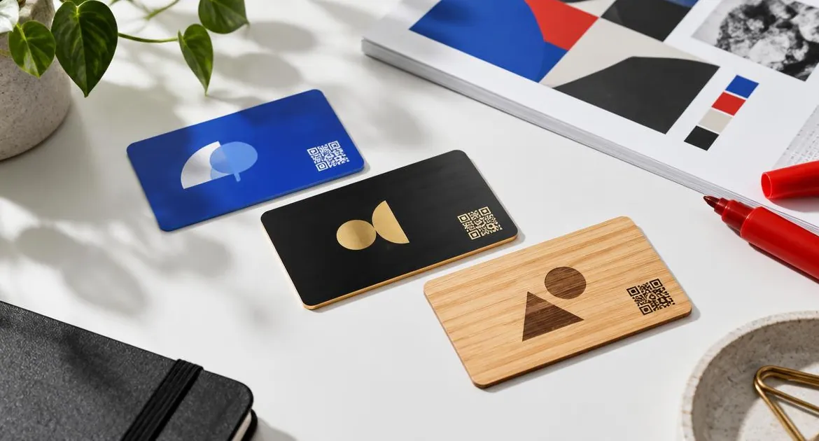
On an NFC business card the chip does the sharing, so the printed design has one job: to show who you are and invite a tap. That makes good design simpler than on a paper card. You need a clear name, a short role, a logo that reads at small size and a QR code nobody has to hunt for.
This guide covers how the logo upload works on our card page, what goes on each side, how to get good contrast on PVC, metal and bamboo, and how to check everything before you order. For the basics of the card itself, see our guide to how NFC business cards work.
What you can customise
On our card page you set:
- the material and colour: PVC in Black, Green, Brown or Blue; bamboo wood in White Bamboo or Original Bamboo; or black metal with a gold or silver finish;
- the name on the card, typed in a text field;
- the role on the card, also typed, and optional;
- your logo, as a paid option, uploaded as a file;
- removing the platform branding, as a separate paid option.
Everything else, such as your phone number, email, website and links, goes on your online profile. That is deliberate. Printed details cannot change, but the profile can.
How the logo upload works
When you tick "Add Logo" on the card page, an upload box appears.
- Choose the file. The upload accepts PNG, JPG, WebP, GIF, SVG, PDF and AI files, up to 10 MB. The box recommends PNG, JPG or SVG with a transparent background.
- Wait for the upload. The box confirms when the file has uploaded.
- Adjust the logo. For image files you see a preview, and you can adjust the logo's size and position. Your logo is fitted into the logo space on the card.
- Replace it if needed. Click the box again to choose a different file.
A PDF or AI file uploads without an on-screen preview, so check it carefully before you upload it.
Which file to choose
- SVG or a large PNG keeps edges sharp. A small, blurry image stays blurry when printed.
- A transparent background stops a white box appearing around your logo on a coloured card.
- One clear version of your logo works better than a busy one. Drop taglines and fine text that would be too small to read.
If your logo comes in light and dark versions, have both ready. The right one depends on the material.
Front and back: what goes where
On our standard layout, one side carries your logo, a tap symbol, your name and your role. The other side carries the QR code. The tap symbol shows people where to hold their phone, and the QR code has a side to itself so it scans cleanly.
For PVC cards, the Preview button on the card page shows the layout with your name, role and logo where a preview is available. Use it before you add the card to your basket.
A few rules keep the layout clean:
- Keep the name short. Use the name people know you by.
- Keep the role short. One line reads better than two.
- Leave space around the QR code. It needs a clear margin to scan quickly.
- Do not add a second QR code or a web address. The chip and the printed code already open your profile.
Contrast on each material
Contrast is the difference between your logo and the card behind it. Good contrast makes a logo readable from arm's length.
| Material | Card colour | Logo versions that tend to read best | Watch out for |
|---|---|---|---|
| PVC | Black, Green, Brown or Blue | Light or white logos; bright colours on Black | Dark logos on Brown or Blue |
| Metal | Black with a gold or silver finish | Light logos, or one that suits the gold or silver | Fine detail and thin lines |
| Bamboo wood | White Bamboo or Original Bamboo | Dark, simple logos | Pale colours and very thin text |
Dark PVC
On Black PVC most logos work if they are light. On Green, Brown and Blue, a white or very light version is usually the safest choice. Test it in your head: would the logo read on a coloured sign at the same size?
Metal
Metal cards are black with a gold or silver finish. Choose the finish that suits your logo. A light logo or a logo that matches the finish reads well. Keep it simple, because fine lines are harder to see on a dark metal card.
The Preview button is not shown for metal or wood cards, so take extra care with the logo version you upload. Our guide to metal NFC business cards explains the finishes and the feel.
Bamboo
Bamboo has a pale, natural grain, and each card is slightly different. A dark, solid logo reads best. Avoid very pale colours and thin type, which can get lost in the grain.
The remove-branding option
By default the card carries the platform branding. On the card page there is a paid option, shown as "Remove Lets Connect branding", that takes it off. Choose it if you want only your own name and logo on the card, for example for a team or client-facing role.
It does not change the chip, the QR code or your profile.
Proofing: check before you order
The details you enter on the card page are what goes to print, so treat that page as your proof. Personalised cards are made to order and are not returnable for a change of mind, so check everything first.
- Spelling. Read the name and role letter by letter, including capitals and accents.
- The role. Check it is the title you want shown, or leave the field blank.
- The logo. Check the preview, size and position. Make sure it is the right version for the material.
- The material and colour. Check the options you selected.
- The plan. Check the profile plan is the one you want.
- The quantity. Check the number of cards.
For a team, collect each person's name and role in writing and copy them exactly. Our checklist before you buy an NFC business card covers the other points to confirm.
Design the profile too
The card is only half of the design. The profile people see after a tap matters just as much.
- Put your name, role, phone and email at the top, with the save-contact button easy to find.
- Use the same logo and colours as the card, so the two feel like one thing.
- Keep links in the order people need them: website, booking or portfolio, then social profiles.
- Remove anything you would not print on a card.
You can edit the profile at any time, so it can grow with you. The printed card stays the same. If your work is visual, our guide for photographers and videographers shows a portfolio-first profile, and our guide to wooden NFC business cards covers designing for bamboo.
Common design mistakes
- Too much text. A phone number, email and website on the card compete with your name. They belong on the profile.
- A logo that disappears. A dark logo on Black PVC or dark metal, or a pale logo on bamboo, is hard to read.
- A white box around the logo. Use a file with a transparent background.
- A cramped QR code. Leave the code its own clear space.
- Mixed versions across a team. Use the same logo file and the same style of role for everyone.
A simple design that works
If you are unsure, start simple: Black PVC, your name, a short role and a white version of your logo. It is clear, it costs the least of the three materials and it shows the QR code well. You can try metal or bamboo for your next card and point it at the same profile.
See every material and option on our NFC business card page.
Frequently asked questions
Which file types can I upload for my logo?
PNG, JPG, WebP, GIF, SVG, PDF and AI files up to 10 MB. A PNG or SVG with a transparent background usually works best.
Can I move or resize my logo?
Yes. After you upload an image file, you can adjust the logo's size and position. It is fitted into the logo space on the card.
Where does the QR code go?
On our standard layout the QR code has a side of the card to itself. The other side carries your logo, a tap symbol, your name and your role.
Can I see a preview before I order?
For PVC cards, the Preview button on the card page shows the layout with your details where a preview is available. It is not shown for metal or wood.
Can I remove the platform branding?
Yes. It is a paid option on the card page, shown as "Remove Lets Connect branding".
What if I spot a typo after ordering?
Personalised cards are made to order, so check the name and role before you pay. Contact us straight away if you spot a mistake.
Which logo colour works on bamboo?
A dark, simple logo usually reads best on the pale grain of bamboo.